Overview
Scandaypay is a fintech solution that allows users to make payments, and receive payments easily via QR. It also has a virtual dollar card feature that'll allow users make online transactions seamlessly
Role - Product Designer
Product Strategy, User Research, Interaction Design, Visual Design, Prototyping & Testing, Pitching
Introduction
This project aimed to create a solution that simplifies the payment processes. It allows users to easily and conveniently make international transactions. With Scandapay, users can create QR codes easily, and then use the QR codes to receive payments from other users or send gifts/rewards to other users. The users scan the QR code to receive their reward. Scandapay has undergone lots of redesigns, and in this case study, I will be working you through them.
My UX Design Process
Research
Here I will walk you through all the research methods involved in the project.
Analysis & Insight
This section focuses on all the insights gotten from analysing the results of the research.
Design & Prototyping
Here we created the wireframes and the prototypes of the mobile app.
Testing & Iteration
We then proceed to testing. We analysed users interaction by asking users to experience the app and give feedback using a survey.
UX Redesign
After the feedback from users on their experience with the product, we proceeded to redesign both the interface and the experience.
Research
The first step was to conduct user interviews to determine the experience users have with e-commerce apps. This was achieved by using surveys to understand the pain points, expectations, and preferences of potential users.

The Survey
The survey was carried out using Google Forms. Some questions were designed and then sent to tech-savvy individuals who would have experience using a Fintech app. The responses were positive and aligned with our goals for Scandapay.
Responses & Feedbacks

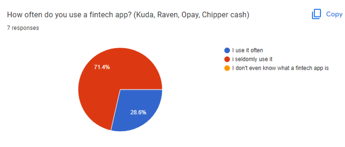
We asked responders if they had used a fintech app before to make payments online. 71.4% of respondents said they don't use it often, while 28.6% claimed they use it often. This shows that people at least know what fintech apps are.

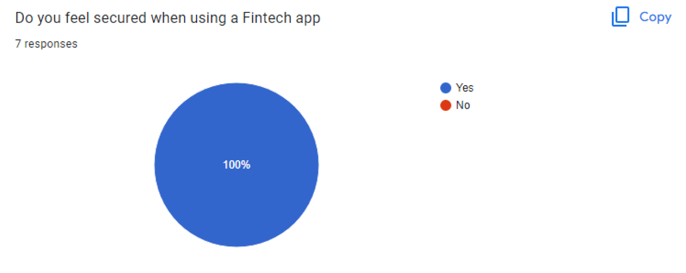
We also asked users if they feel secure when using a fintech app, and they claimed they do. This shows that fintech apps have improved significantly in security.

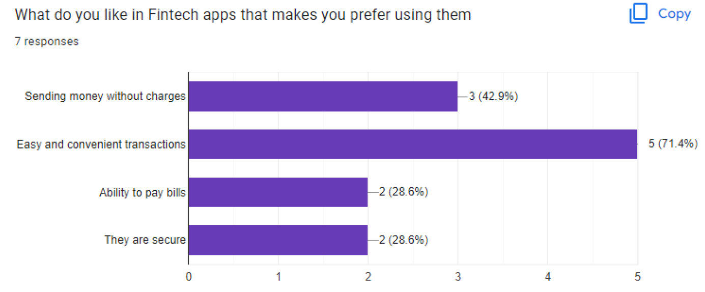
We also wanted to know what attracts users to fintech apps, that makes users like using them. Most users said it was the convenience, and ease they offer when performing transactions.

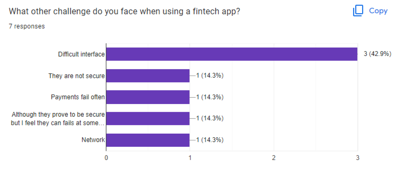
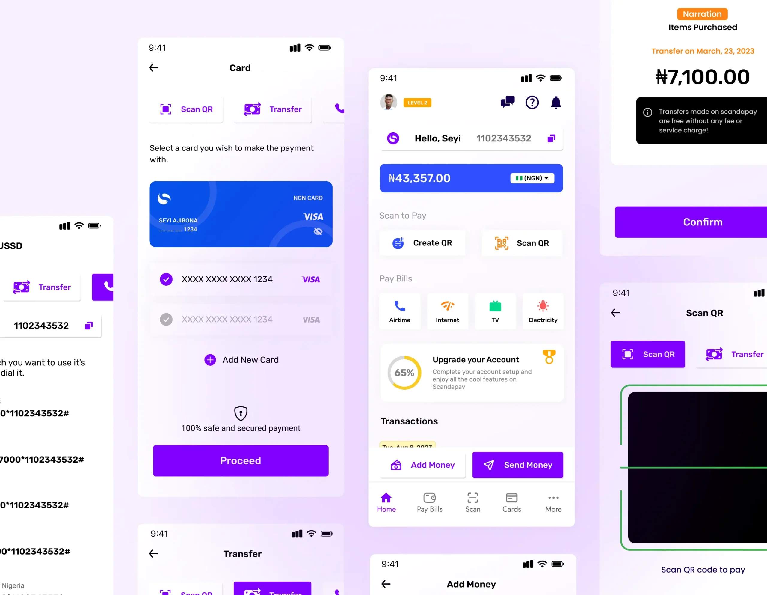
We asked about the challenges users encounter, and most of them agreed that the interface sometimes can be a bit complicated to navigate.
Analysis & Insights
We then analyed the data gotten from the research conducted and we identified some common painpoints of responders/users. We then proceeded to create some user personas to help us understand the solution to be developed, and we described what a successful experience of our app should look like by crafting a customer journey map.
User Pain Points
Needs
Users need a solution to help them make payments easily.
Complex Experience
The process of going from one point to another should be simplified. Complex UX usually leads to frustrated customers.
Charges
Users also complained about the exorbitant payment charges they get when paying online.
User Interface
Users had challenges with complicated interface screens, complex/multiple features, or functions on one screen.

Competitive Analysis
We identified a popular competitor offering the same solution, and we analyzed them using the SWOT analysis to measure their strength, weakness, opportunities, and the threats they might be facing.
SWOT Analysis
Chipper Cash
Strength
Easy-to-use platform Transactions are free. Fewer words are used. Modern design style used. Sending money is easy
Weakness
Doesn’t allow you to send any currency of choice to a receiver irrespective of their location. Can’t be used to create QR codes for receiving payments.
Opportunities
Allow users to be able to send any currency they want to a receiver, irrespective of their location. Enable an easy way to receive payment on the platform.
Threats
There are emerging competitors. Government policies and regulations.
User Personas
We created user personas to further empathize with the users, and also keep track of the core solutions the product provides. These personas represent a larger group of our audiences, and we believe designing to suit these personas, takes care of our users’ needs.
Persona One - Mike

Details
Age: 32
Nationality: Nigerian
Education: B. Sc Education
Occupation: Business Owner
Bio
Mike is a business owner in Lagos, Nigeria. He owns a physical fashion store where he sells clothes to his customers.
Needs
Mike needs an that can allow him to receive payments from his customers faster, and more convenient.
Frustration
Mike is always frustrated with failed and delayed transactions.
Persona Two - Janet

Details
Age: 31
Nationality: Nigerian
Education: B. Sc Business Administration
Occupation: Business Consultant
Bio
Janet is a business consultant with one of the top leading business brands in Nigeria.
Needs
Janet wants to be able to recommend a fintech solution to her clients.
Frustration
She's frustrated with the complicated user interface her clients always complained about.
User Flow Map

Designing & Prototyping
We created simple easy to understand wireframes. We prioritized the customers experience and opted for designs that won’t overwhelm users we they are using the platform for the first time.

The Home Page
We collected feedback from users that experienced the initial design of Scandapay, while users appreciated the simplicity of the interface, the experience was not good. Users complained of extra unnecessary steps that should be simplified, so we decided to redesign the interface, making each feature accessible from the interface.
Authentication Screens

Adding Money on Scandapay
Users are presented with different options and ways to add money to the platform. Users can add money by scaning a QR Code, Copying their account details and transfering from the bank app, Users can also add money via USSD Codes, and also they can add money from their cards. The process of adding money has been simplified through consistent user centric designs.


Sending Money
Users can choose to send money to other users on the platform through their username or send money to other banks by adding an account number, bank, and account name.
Paying Bills
Users can easily pay bills on the platform. The list of bills that can be paid for with Scandapay is listed on the homepage. Users will select a type of bill to pay, and then follow the steps to make payment for the bills.

Creating QR Codes
Users can create QR codes to receive money and also to reward other users on the platform easily. The QR code that was created will only be assigned to the specific user it was created to request money from, or to gift/reward.

Virtual Cards
Scandapay allows users to create virtual cards. These virtual cards can be used to pay for goods and services online. Users can create a Naira virtual card (NGN Card), or a Dollar virtual card (USD Card). The experience of the virtual dollar card was also improved by redesigning the confirmation screens, this is to ensure that user confirm a transaction before it goes through.

Testing & Iteration
We created simple easy to understand wireframes. We prioritized the customers experience and opted for designs that won’t overwhelm users we they are using the platform for the first time.
User Testing
Usability testing was conducted with a diverse set of users to evaluate the app’s navigation, findability, and overall user experience. The prototype was sent out to some target audience to experience. Valuable insights were gathered, guiding the refinement of the design and interaction patterns.
Iterative Design
The feedback collected from use testing was carefully analyzed, and necessary modifications were made to address identified issues and optimize the user experience. The iterative design cycles were repeated, ensuring continuous improvement based on the feedback gotten from users, until a much more desirable experience and usability was achieved.
UX Redesign
After sending out the initial design, and getting feedback on the usability of the product, I decided to redesign the product, and also simplify the experience, getting rid of unnecessary flows.
Homepage UX Redesign
Redesigned the homepage, adopting a more relatable approach to design. I analyzed competitors’ UIÂ and observed patterns, and similarities. Then I adopted these patterns to create the current homepage design.

Key Takeaways
This product redesign case study provided valuable lessons that can be applied to future projects. From the significance of user research and setting clear goals to the power of collaboration and iterative design, these lessons emphasize the importance of a user-centered approach and continuous improvement. By incorporating these learnings, teams can optimize their product redesign efforts and deliver compelling user experiences.
Â
Lesson Learnt
Adopting an iterative design process was pivotal in the product redesign’s success. Instead of aiming for a perfect final version in one go, we iteratively refined the product based on user feedback and data analysis. This approach allowed us to test concepts, validate assumptions, and continuously improve the user experience.
Conducting regular usability testing throughout the redesign process was a game-changer. It helped us identify pain points, discover usability flaws, and uncover hidden user needs. By incorporating usability testing as a continuous loop, we ensured that user feedback was integrated into every iteration, resulting in a more user-centered redesign.
Style Guide


Let's Connect
Thank you for all your support throughout the course of this project! 
If you would like to work with me, or collaborate with me, please reach out to me via the following
Seyiajibona002@gmail.com
Phone
+234 8024628728
Address
Lagos, Nigeria.